Yes Mechanic
Turning car care into a tap-and-go experience
Work period
Aug 2022 - Dec 2022
// India
Role
Lead UI/UX Designer
Client
Amshuhu Pvt. Ltd, India
Tools
Figma, Adobe suite, Procreate
Yes Mechanic is a car care service provider that has established itself as a reliable choice for vehicle owners. Their web-based platform offers a wide range of services, from regular maintenance to emergency assistance. With a growing user base, the company sought to expand its service accessibility by developing its first-ever mobile application.
Understanding the Problem
Objective
The primary goal of the project was to translate Yes Mechanic’s web-based car care services into an efficient mobile application. The app needed to address current pain points in the booking process, improve user retention, and enhance the overall service experience.
Challenges
-
Significant drop-off rates during the service booking process on the website.
-
Users found the existing booking system cumbersome, leading many to resort to phone calls.
-
Users reported difficulty in finding relevant information quickly, such as service details, pricing, and technician availability.
-
The platform lacked tailored recommendations or reminders based on user behaviour and vehicle history.
Design Process
The project began with a thorough analysis of Yes Mechanic’s existing website to understand its performance and user behavior. Using user journey mapping and heat map analysis, we identified multiple choke points where users often dropped off or opted to call instead of booking services online. To further explore these pain points, I conducted interviews and surveys with the founders, their team, and the diverse user groups. This helped uncover critical issues in the current booking flow and provided a deeper understanding of how the overall process functioned behind the scenes.

Target user group
User Persona


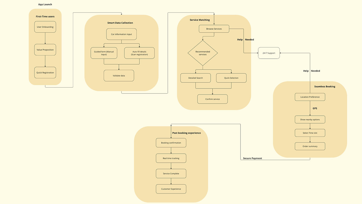
User flow
Design Phase
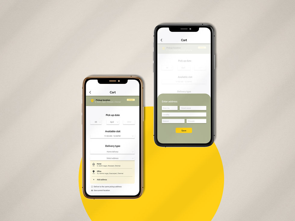
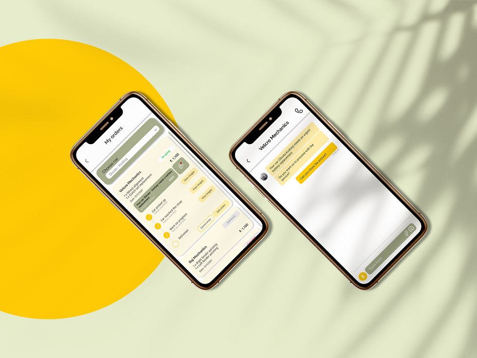
To address the challenges identified in the research phase, my solution focused on simplifying the user experience, improving accessibility, and ensuring that the app would encourage users to complete the booking process without feeling overwhelmed or frustrated. I adopted a mobile-first design approach, ensuring the app was seamless across all devices, but particularly optimized for mobile, where users would interact most frequently.
The goal was to ensure clarity in user journeys while identifying potential usability challenges early. Stakeholders reviewed these initial concepts, providing feedback on areas for improvement before moving to the next phase.

Once the design concepts were finalized, high-fidelity wireframes were created to closely resemble the final product in terms of visuals, interactivity, and functionality. These wireframes were tested with real users to simulate the actual experience, allowing us to gather valuable feedback on usability and identify any areas of confusion or inefficiency. By observing users interacting with the wireframes, we were able to pinpoint specific pain points, such as unclear navigation or complex form inputs, and make iterative design improvements.

key strategic design decisions that shaped the app:
-
Instead of overwhelming users with all features at once, I broke the onboarding into digestible steps that gradually introduced them to key app functionalities based on their usage patterns.
-
Made fields like vehicle numbers optional, allowing users to proceed without requiring hard-to-remember information upfront, reducing friction during the booking process.
-
Introduced a “One-Tap Booking” feature for repeat customers to allow quick rebooking of their last service with a single action, enhancing convenience and retention.
-
Streamlined the service booking process with fewer steps and clearer progression.
-
Organized services into intuitive categories with icons and search functionality.
-
Leveraged user profiles, tailored recommendations, and push notifications to drive repeat engagement and satisfaction.